Documentary poster for Lily Ahree Siegel’s The Space Between You & Me. The poster was inspired by different forms of collaging: bojagi (a Korean traditional patchwork technique) as well as private conversations with Lily about using the internet to piece together her identity while growing up in the 2000s.
Lily is a Korean-American adoptee, exploring the trauma of international adoption through her birth mother, Myungsoon, and another Korean American adoptee, Emily. The reasons for adoption are often complex, sad, and bittersweet. Through sharing Korean culture, making kimchi, or getting a tattoo, Emily and Lily have different ways to reclaim their lost identity. But can they ever find belonging between these two worlds?
Poster for an artist lecture by Jeremy Dennis. His work uses the geolocation technology with Google Maps to highlight indigenous cultural sites and their histories in New York. Themes include historical invisibility, technology, and locality.
Poster for a lecture by Dr. Nicole Fleetwood, whose work revolves around incarcerated contemporary artists and their experiences. Themes include prison conditions of constricted space, solitary confinement ("no touch punishment"), grids and rigidity.
For 2019’s Queer Liberation March (QLM), the NY chapter of historic HIV activist group ACT UP needed visuals to accompany their planned die-in. Posters were made to bring attention to HIV-related deaths while in ICE detainment since ICE’s inception. Upon cue, participants would lie motionless on the ground and remain silent to honor those who died in custody.
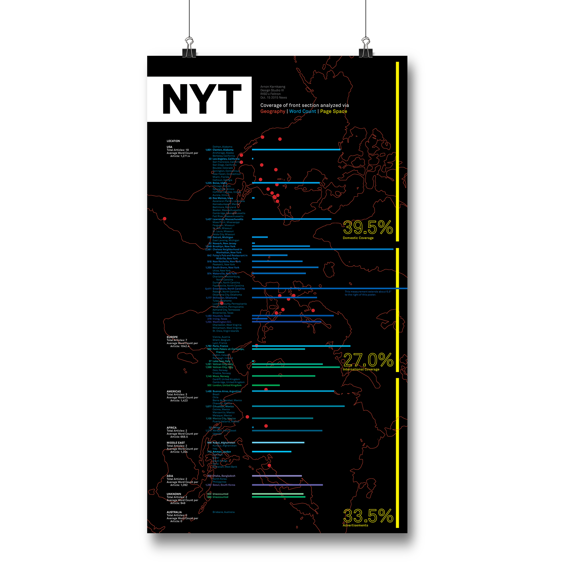
Western newspapers are often complicit with unconscious bias with whom and where the staff cover. Often with media, there are many current journalism sources that do not necessarily cover newsworthy events, simply because of place or audience. After analyzing the New York Times front section, information is presented to show the newspaper's coverage through geography, page space, and word count. The poster is meant to be read in three different ways that are color coded in order to gain a greater understanding of the coverage within the front section.
Data was collected by gathering articles online and calculating each article’s word count and page space. Collected data was put onto a spreadsheet and categorized by location and whether the content was international, domestic, or an advertisement. Page space was collected separately and calculated in percentages.
Check out the data collection here.
Advised by Nicholas Felton and Paul Soulellis.


